Monday, September 28, 2015

Worried about speaking/teaching/presenting in front of an audience? Here's the cure!

So, you have to put on a presentation in the near future…. Maybe your profession doesn’t require you to do much public speaking and you’re nervous about doing this. Or maybe you do some public speaking but you’re still kind of nervous about the whole idea.

The reasons why you’re nervous might vary – you haven’t done much public speaking; or perhaps you have to put on a presentation with new and unfamiliar material; maybe it’s a completely new audience you’ll be in front of; or it could be that maybe you’re delivering it via a different method (e.g., Skype vs. in-person).
Presenting virtually vs in-person is a subject I will leave for a different day.

But, I’ve done all kinds of public speaking, so I will address this day some of the things I’ve learned about doing so.
To begin with, I’d  offer up that everyone feels at least some level of anxiety before speaking in public. So, what you’re feeling is perfectly normal.

Secondly, whether you are a novice public speaker or you do so routinely, I would offer you that the best answer for giving a great presentation is – are you ready for this? – the same method as it’s been since probably the ancient Greeks first perfected the art of oratory; 

  • BE PREPARED! STUDY! KNOW YOUR STUFF!
  • Practice, practice, practice!

Yep. That’s alllll there is to it. Really.
A note of caution though; that’s also (in its own way) a very big tasking. If it’s only a speech-type of presentation you should know every key point of your talk and the supporting statements in it.

If it’s a training presentation, then you need to go beyond that and know as much as possible about each key point - as in well beyond those key points. That way you can anticipate audience questions and be better prepared to answer them.
Take note; being as familiar as possible with the material is only half the battle. The other half is practicing your presentation. Practice is, IMHO, every bit as important as the preparation.

Why? because it’s right here that you win the audience. It’s in the practice phase that you 1) become ultra-familiar with the material, its order and flow and when you are bringing what points to completion.
The practice phase is also where you perfect your tone, voice inflections, rhythm and – this is often overlooked but is quite critical – you learn where your vulnerabilities are. It’s THIS phase that allows you to make eye contact with your audience (and keep it) during your talk. Why? Because you are so familiar with the material and the order in which you’re presenting it – you’ve practiced it over and over and over again - that you know what’s coming and when it’s coming in the presentation.  So, you’re able to and comfortable enough to not stare at your speaker notes or the visual aids you’re using in your talk (If you’re using PowerPoint in your presentation, I’m lookin’ at you, here).

And…. If there’s any vulnerabilities in your talk, any emotional threats to your speaker voice, this is where you’ll discover it and prepare your defense to it.
Here’s an example of what I mean by a vulnerability; a few years ago, I was asked to deliver the eulogy at a funeral. Like every other talk I give or presentation I make, I made time in my schedule to rehearse this eulogy multiple, multiple times. That way I not only knew when to accent what, when to pause for effect etc so much that my delivery seemed utterly and absolutely natural, but also I knew when my voice was liable to crack with emotion.

What’s the “cure” for those vulnerabilities? Practice saying them – out loud – again, again, again and again and again. Does that remove the emotion? No. But, it helps you know when the vulnerable phrase is coming and helps you condition your voice to stay strong and natural during those particularly vulnerable phrases.
So, you have to put on a presentation in the near future…. And you’re nervous about it. Cut yourself some slack and remember that everybody feels somewhat nervous before speaking in public. Then make some time in your schedule to get as familiar with the topic list as you can. Then sequester yourself someplace private for a few hours and practice it – out loud, with gestures and increasing eye contact - as many times as possible.

If about now you’re thinking; “That doesn’t sound like public speaking, that sounds like actors memorizing and saying lines in a play.” To that, I’d say; “Yep. You’re right. Both situations utilize a lot of the same techniques.”
So, go! Prepare! Practice! Then give that presentation! You’ll do a smashing good job!
Announcing; My new teaching and instructional design blog is up and running!

I've decided to launch a blog offering my 2 cents (maybe what its worth) from my experience teaching and developing courseware. 

As fellow instructor/facilitator types,just for kicks, I put you on the publish list. (Please advise if you want me to remove you.)

I've prepared a series of initial entries to launch it with. You can read them at http://instructionalsolutions2.blogspot.com/.

Enjoy.

DN

Friday, September 18, 2015

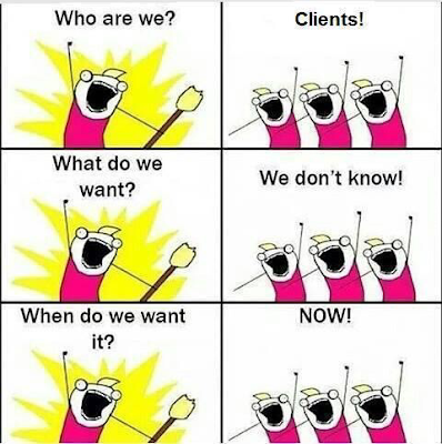
Some instructional design humor


Remember; courseware development is glamorous!  


Time.... is what we want most but use the worst. (Wm Penn)

How many times have you been in a class or a workshop or some other event and the facilitator tells you to turn to the person next to you or huddle with the folks at your table and for five minutes brainstorm, discuss or analyze a given point, a situation or a mini-case study?

Before you answer, think about the demographics of the people in the audience – at least those you’d just been asked to interact with. Did you know them? At all? Were you comfortable opening up and sharing your thoughts and opinions on the subject with them? Had you had enough time to think through the question, case study or whatever yet to form an opinion on it?

Have you ever been to such an event and felt like you or perhaps your group was just beginning to engage with the question when the facilitator says BUZZ! Time’s up; time to turn around and report to the audience what you or your team came up with. And you’re left thinking, “Wait a minute! We’re just getting started here.”

Often, far too often, presenters get so eager to 1) involve the audience in some participatory exercise and 2) to keep things moving and on schedule that rarely is there adequate time allotted for people to properly engage with the material and their peers to give effective input.

And hence, this becomes more an exercise to say we did rather than to actually and effectively do.
In fairness, it’s easy for we facilitators who are oh-so-familiar with our topics to mistakenly assume our audiences are almost equally as familiar with the material. Hence, it’s easy to fall into the trap of thinking that such exercises really won’t take that long to accomplish with our audience.

Most workshops, meetings and the like where this technique is – IMHO – ineffectively implemented are attended by folks who hardly know one another. They may be industry peers or even members of the same company or group in a company but there’s a LOT of dynamics for facilitator’s to consider here and design into the agenda.

For one, even if these people know one another intimately and are very comfortable speaking their mind in one another’s presence, not everyone analyze something and form thoughts about it at the same speed. So time should be built in for these different rate people to all have adequate time.

And, some people may be shy in general and take awhile to warm to the group they’re teamed with at the event enough to feel comfortable offering an opinion about anything to the others.

Dynamics like these are all things that facilitators should consider when laying out the agenda. And – most importantly – and they must be designed into the presentation and the timetable. Otherwise you risk participant frustration, disengagement or continued discussion amongst audience members as the facilitator tries to get things moving along.  


Tuesday, September 1, 2015

The best instructional design is often...when less is more.

The world famous scientist Albert Einstein once said, “Any intelligent fool can make things bigger and more complex…. It takes a touch of genius – and a lot of courage to move in the opposite direction.”
Leonardo da Vinci said, “Simplicity is the ultimate sophistication.
Yet when training courses are designed and laid out, it amazes me how much emphasis is put on doing something – e.g., putting in tons of graphics (for instructor-led presentations or putting all kinds of  functionalities in Elearning course)…well, just because we can.
Certainly, in today’s world, amazing technology is in the hands of common everyday people (GoPro video cameras, smart phones and their built in cameras, video/audio editing apps, and the like). And most of it is really pretty cool stuff. I mean, don’t get me wrong; I’m not anti-technology. It really is cool to be able to take a GoPro camera bought at Best Buy on a dive in a shark cage off the coast of Brazil and upload the video you shot of the sharks that swam by to YouTube that evening.
But, when it comes to learning courses, oftentimes there’s a lot of wisdom in the phrase “Less is more.”
However, often people decide to convert current fully-functional courseware into the latest, greatest software just…because it’s available and would seem to be the most sophisticated thing to do. Really? Was there something wrong with the current platform – like it didn’t work? Can it be updated? Otherwise, maybe it should be left alone under the advice of “If it ain’t broke, don’t fix it.”
Case in point; I was at a large symposium recently in Washington, DC. A young lady from a university that shall remain nameless made a big deal when she got up to present how she knew we all must’ve been tired of seeing PowerPoint presentations and that she’d went out and found some new software platform to host her presentation that was going to blow us away.
Maybe it would. But she never got that far because the software wouldn’t launch. Maybe it was the wireless connection there (which admittedly left a lot to be desired), maybe it was her computer or maybe it was who knows what? But, it wouldn’t work. And she and her presentation content slowly disintegrated on stage – painfully, for us in the audience. So, you know it had to be utter agony for her.
What’s the point here? The point is, progress is nice and “doing something different” has its place in keeping audiences engaged. But, one has to go into these things carefully. What works in the office on a T-1 cable or something may not work at all out in the field working on a wireless network.
And, while I’m on a roll here, how much flash and zing does one need to make the point and keep the audience engaged? My advice is keep it simple – do only that amount of animation, etc. Doing so will keep it simple and dependable.
Right about now some of the PowerPoint abusers and techies are probably fuming at their screens as they read this. PowerPoint abusers think that they the speaker are there to support the visual aids rather than the other way around. I’m sure you’ve seen these folks in action with presentations from the podium that have all kinds of images flying round each slide literally bombarding the audience with so many graphics and often images so captivating the audience stops listening to the presenter. Instead of listening, they’re studying a graphic either captivated by the beauty of the image or…wondering what the hell is that a picture of?”
Our techie friends who seem to think that only robust technology and functionalities can accomplish anything – especially in elearning – really struggle with the “less is more” philosophy. If the audience analysis, needs analysis, available time and allocated project budget show that a change to a more recent, robust and/or complex technology solution is the way to go, then by all means do it.
But, my point here is that if it doesn’t, then don’t go that way. Elearning audiences really can be reached and taught effectively – with sophistication and elegance, I would purport - by a less robust approach. In furtherance of the point I offer this example of pure instructional design brilliance:


Monday, August 31, 2015

The best instructors in the business say ‘I don’t know’ rather than try to BS* their way thru it.

One of the best pieces of teaching advice I ever got was “If you don’t know…say you don’t know.”

I was a young pilot instructor teaching in a major flight training center and pilots hate seeming to not know everything about their craft. Maybe we think that somehow makes us seem less a safe pilot, less the aviator extraordinaire than other pilots or why exactly. But, we do. And instructor pilots can really struggle with this – especially when we’re young and/or inexperienced. 

As such, accepting that it was OK for me the instructor to say “I dunno” in front of a room full of experienced pilot learners was a hard thing for a young instructor pilot like me to want to embrace. Especially when I would be doing so when standing in front of a room full of pilots who had 1) traveled great distances to come to training and 2) probably paid my company serious money for the privilege to do so.

But, that advice was invaluable. Because almost without fail, instructors of any subject – finance, music, science, auto mechanics or whatever - who are BS’ing some kind of flim-flam answer to a question to which they have no clue what the answer is, will – sooner or later - expose themselves as not knowing the answer. And once that happens, their credibility with that audience of learners is gone.

If you’ve ever had the painful experience of watching an instructor fail on-stage as they get caught in the act of trying to fake an answer to a class of learners, you know what I’m talking about. What did you think of that teacher/facilitator/instructor once you’d realized they were just “shining you on?”

The point here is, there’s no benefit to trying to BS your way past the question. The risk in trying it is huge - if you care about reaching your students and keeping them engaged for the rest of the training. But! Fear not! The benefits of admitting ignorance are equally big. That’s because someone who has the courage and self-confidence to admit when they don’t know something is instantly deemed as honest and believable – or credible.

Once I learned the smart play was to say "I don’t know" when I truly didn't and to immediately follow it up with, “But, I’ll research that question and get back to you,” life at the podium or the simulator's instructor station got a lot less stressful. And - best of all - the bonding with my learners and their engagement with the learning became that much more deep and impacting for all.

And style's what it's all about, right? It's an engaging, impacting, effective and credible style to just 'fess up to the class and say ya don't know. But, the other half of that credibility is immediately doing the research necessary to get the correct answer to those learners as soon as you possibly can.


PowerPoint gets a bad rap (part deux).

 In my previous entry onpoint , I asked the question “Is it the medium of PowerPoint…that puts the “Death” in “Death by PowerPoint?” In that entry, I asked if it was the medium or a boring instructor that is to blame.

Here we are almost four years downstream from that entry and still I hear people “poo-poo’ing” PowerPoint.

Granted, I grew up back in a time when we kids were the only TV remote control our parents had ever heard of. And when I took Speech class, the only “visual aids” involved were eyeglasses worn in the audience or inanimate objects the speaker displayed to help make a point or two.

In other words, the visual aids were used to help support and enhance the speaker.

But fast-forwarding to the 21st century now we see that now the tail wags the dog. Instead of visual aids supporting a strong speaker making his or her presentation stronger, we have far too many speakers rely on the “flash and dash” of PowerPoint and other software as the main part of a presentation. Anymore it’s almost like the carbon-based life form speaker is only around to take up volume and space and mumble a few stammered phrases during an otherwise silicon-based electronic presentation.

And I’ll go even further; in such bassackward presentations, I notice an infatuation with having some kind of jazzy-and-more-decoration-than-cognitive-support graphic (at least) or, worse, a half dozen images flying round the screen in some useless animation done more “just because” than for any sound instructional design or presentation logic.

In other words, the whole structure and flow of the presentation becomes too much digital entertainment – aka “edutainment” – and less on content and delivery. It’s almost as if the “if ya can’t dazzle them with brilliance, baffle them with BS” phraseology has morphed (decayed) into “if ya can’t dazzle them with gee-whizzery and lightshows, then ya ain’t tryin’ hard enough.”

Newsflash, folks; bombarding your audience with slide after slide of decorative graphics (those that don’t add to the point but are just there to have some kind of onscreen graphic) or those that make points that could just as easily be made by the speaker do nothing but “numb” your audience to the impact of graphics in presentations. Why? Because everyone and I mean everyone one is bombarding their audiences with pointless graphics too – endlessly – slide after slide after slide….

So, it’s small wonder folks still hate PowerPoint presentations. The Irish have a saying, “You can put lipstick on a pig…but, it’s still a pig.” In other words, if your content and/or speaker sucks, you can have all the software toys you want going during a presentation and it’s likely to still suck. Why? because the focus of the presentation is the content and how it’s presented. If it’s a presentation that is done with some kind of speaker on stage, then keep the speaker supported by and not dominated by the visual aids.
It’s ok to have several blank slides (dark screen) in your presentation. Those could and should “show” while the speaker in front of the audience is presenting and is the focus of the audience. Then when an graphic appears on screen it should only be because a graphic is needed to help get the point across. It’s time to get back to the mindset that graphics and visual aids are there to support the presentation not BE the presentation. If we don’t we’re just gonna keep on numbing the audience and alienate them from software-supported presentations even more so than they’ve already become.